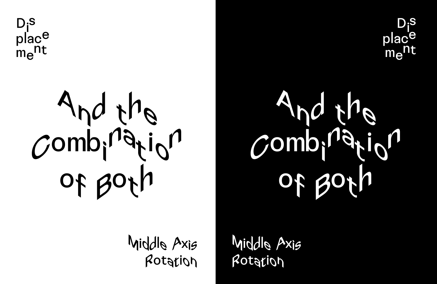
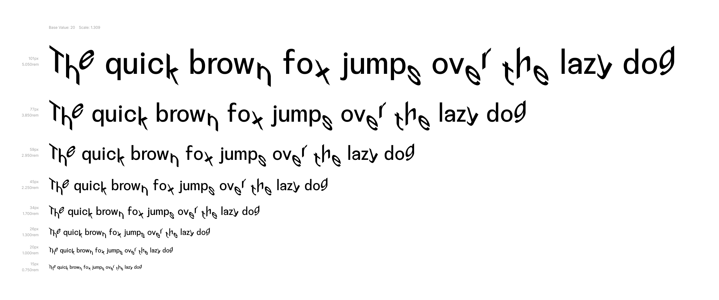
Disorientation Sans Variable Font
sans-serif typeface
Concept
This strategy falls in the footsteps of one of the implementation intended to separate bots from humans — the CAPTCHA (Completely Automated Public Turing test to tell Computers and Humans Apart), which was created at Carnegie Mellon University in 2000. Since then, a lot of websites use different forms of CAPTCHAs to guard against the spambots and other malicious software implementations. Classic CAPTCHAs, which are still in use on some web properties today, involve asking users to identify letters. The letters are distorted so that bots are not likely to be able to identify them. Such tests are rather common in login/signup forms, online polls, and e-commerce checkout pages.
Similar to Disruption Monospace VF, I started with drawing a neutral sans-serif font, which will be used as a base for this typographic experiment. For this typeface, I wanted to create a more ‘erratic’ look, utilising OpenType glyph replacement features: ligatures and contextual alternatives.
Next, a very big decision was to be made — what letter combinations will become ligatures and what letters should get contextual alternatives? As a starting point, I had a look at something, some German-speaking typographers call “schnapps-words” (named so as a tribute to double-vision one gets from indulging a bit too much alcohol) case, when a word contains double letters, like ‘buggy’ or ‘missing’. But it is a minor deviation in a sentence, since “schnapps-words” are not very common.
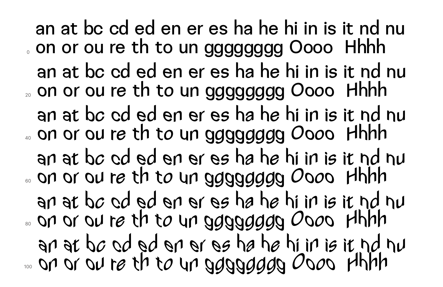
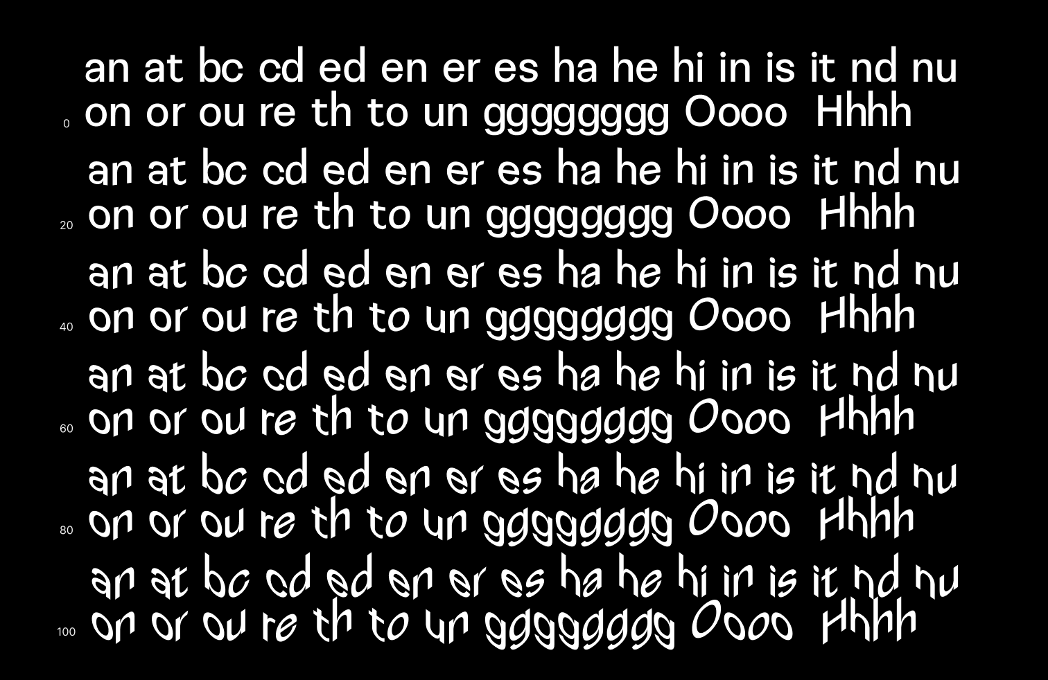
Cryptography researchers of the University of Notre Dame published statistics of letter frequencies in the English language. The analysis of 9,481 English works from Project Gutenberg (plain text files only, minus the human genome project, non-English works, and duplicates) yielded frequencies of letters, bigrams, trigrams and quadrigrams. Of 2,383,373,483 bigrams scanned researchers ranked 20 most frequent, which I took as a second set of ligatures.
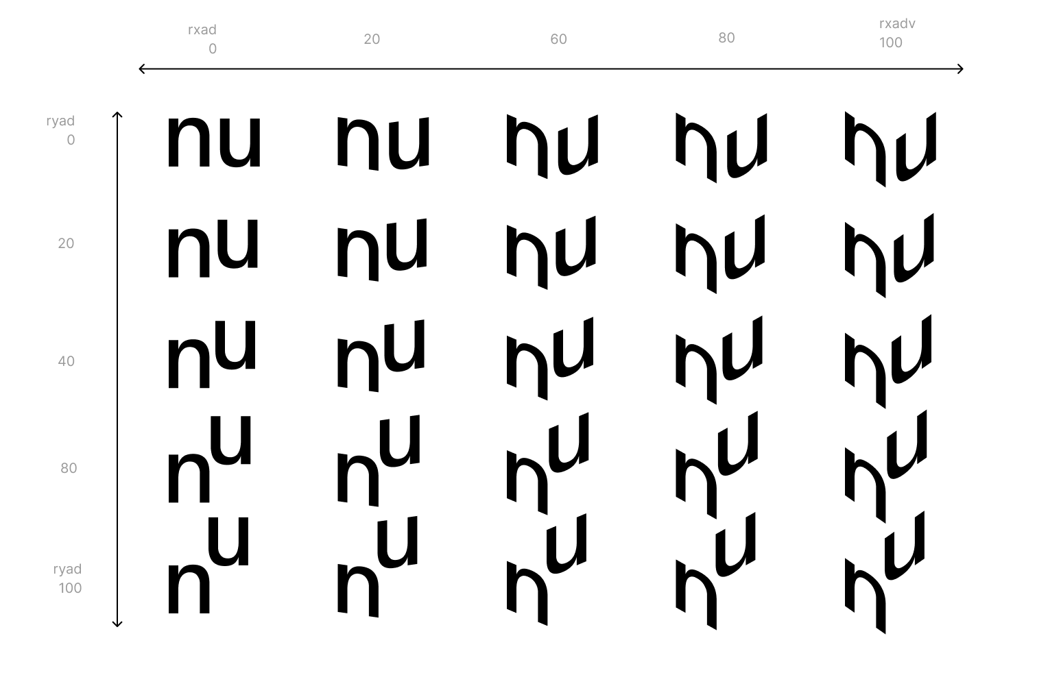
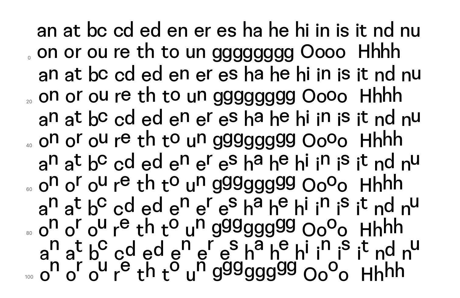
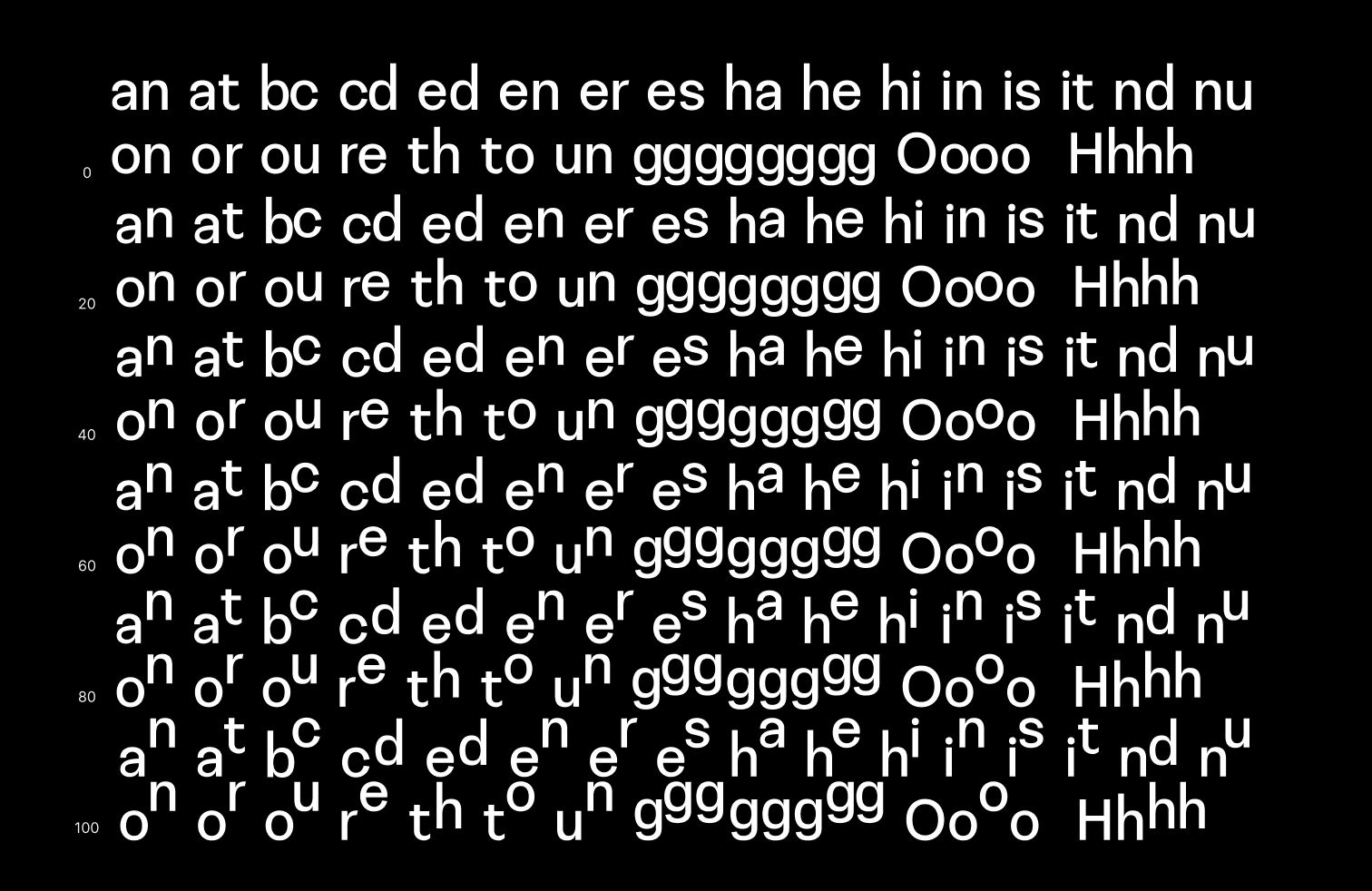
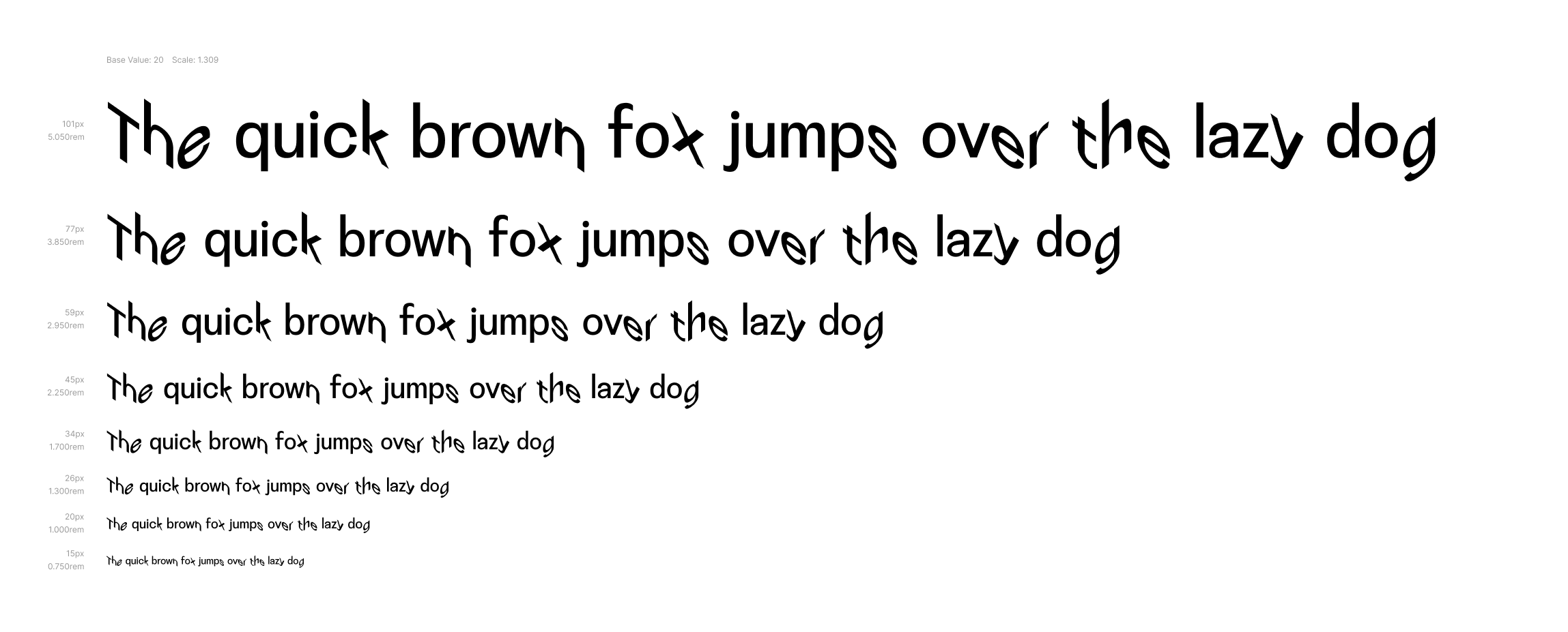
Disruption Monospace VF is drafted as a variable font with two axes of variation — horizontal and vertical. All variations are applied to ligatures and contextual alternatives only. For the horizontal variation, I slanted the ligatures slant up or down from 0 to 35°, which gave a visual effect of a glyph, rotated along its own middle axis. Vertical variation shifts the glyph to the point of first intersect with ascender or descender. To make the interpolation work, I needed at least three master drawings — one for no advance, one for max. horizontal advance and one for max. vertical advance.
To bring some variation in the substitution process, for each ligature I drew 4 variations and two variations for numerals. Along the horizontal axis, the following variations exist: (1) first letter slanted 35° down, last letter slanted 35° up (2) both letters slanted 35° down (3) both letters slanted 35° up and (4) first letter slanted 35° up, last letter slanted 35° down. Along the vertical axis, the following variations exist: (1)second letter pulled up to align with ascender, (2) first letter pulled up to align with ascender, (3) both letters pulled up to ascender, (4) both letters pulled down to descender.
The decision on which glyph used for substitution is being managed by three little “loops” written in the OpenType feature language, making sure no two same ligatures are placed next to each other.
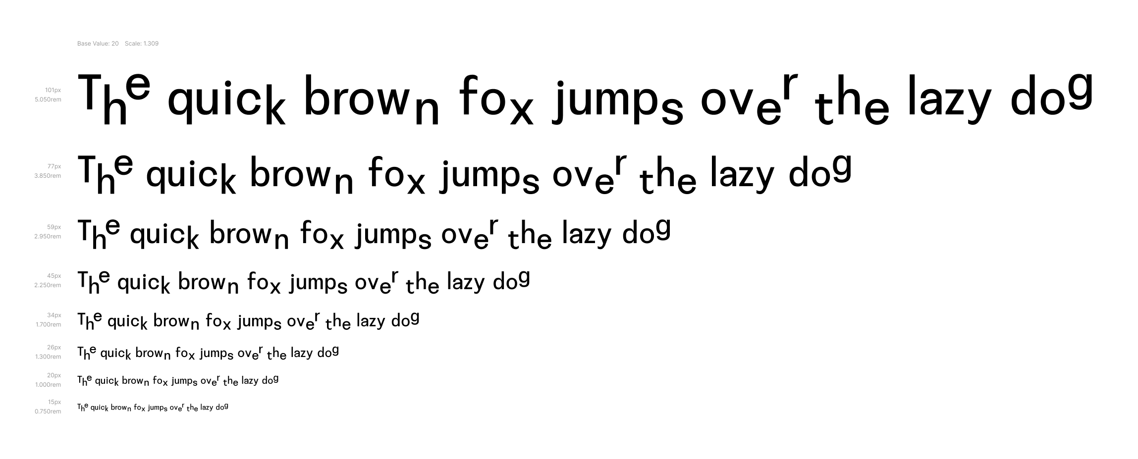
Those rules laid a solid base, but I was craving a bit more going on here. So I introduced initial and final forms of the letter — every uppercase letter got 2 variations for initial forms (letter is first one in the word) and every lowercase letter got 2 variations for final forms (letter is last in the word). Which variation to use, depends upon whether the word begins the sentence or used in-between.
After synchronising all rules and variations along three masters, the experiment grew up to 1137 individual glyphs, which gives the typed sentence its signature eccentric look.
OCR testing
Testing assets
The tests are conducted on the Hoefler's Proof 1.0, which is an illustrative list of english words, organized logically. Using this list instead of classic pangrams allows to test the font's legibility and OCR recognition in a more realistic context.
Since this font in not really optimized for small sizes, descision was made to pull the testing text apart for shorter strings and use larger font size, even though it may have some influence on the final OCR score. If we use larger font size and fewer words in testing, it will on one hand speed up the recognition process, but provide clearer shapes of letters for OCR to work with. After some consideration, it was also assumed, that in such case there will be also less context on the test page for OCR to support a decision to recognise shape as a letter, so in the end it seemed like a fair trade-off.
In order to maintain uniformity, 9 testing sets were created - for 0, 50 and 100 along both axis. For each weight two sizes were selected: 40pt and 80pt, with line height 125% of font size.
Testing method
As a next step, test images containing sample text, set in selected font settings were generated. With 27 images per font setting, there are altogether 243 testing images for Disorientation Sans VF. Those were loaded individually into the OCR testing environment, recognition results documented in a screenshots and a score table and later evaluated.
Results
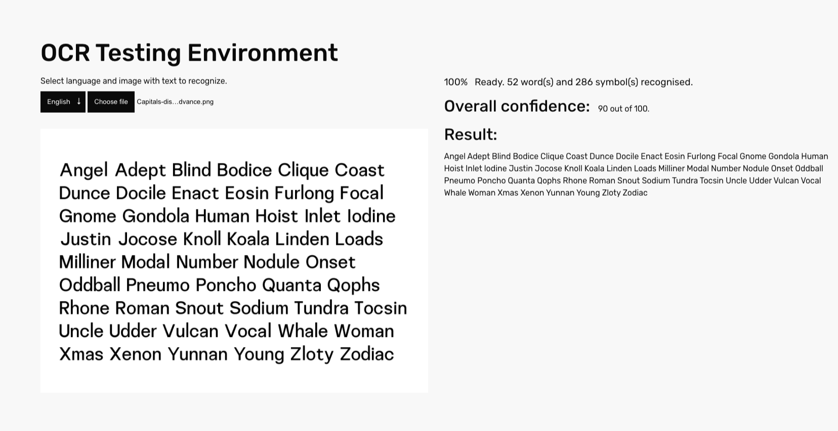
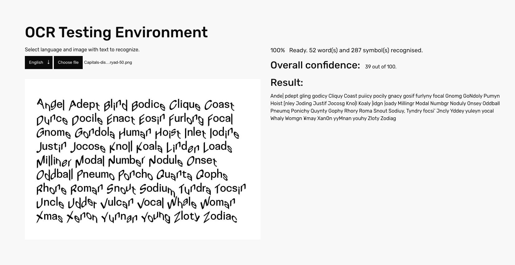
Since this typeface uses less straightforward strategies to avoid being recognised, we have a possibility to compare how much OpenType features push the confidence score down. Font instance with no advance scores 90 points out of 100 and returns the correct text string, which is not the case if we move on any single axis of variation.
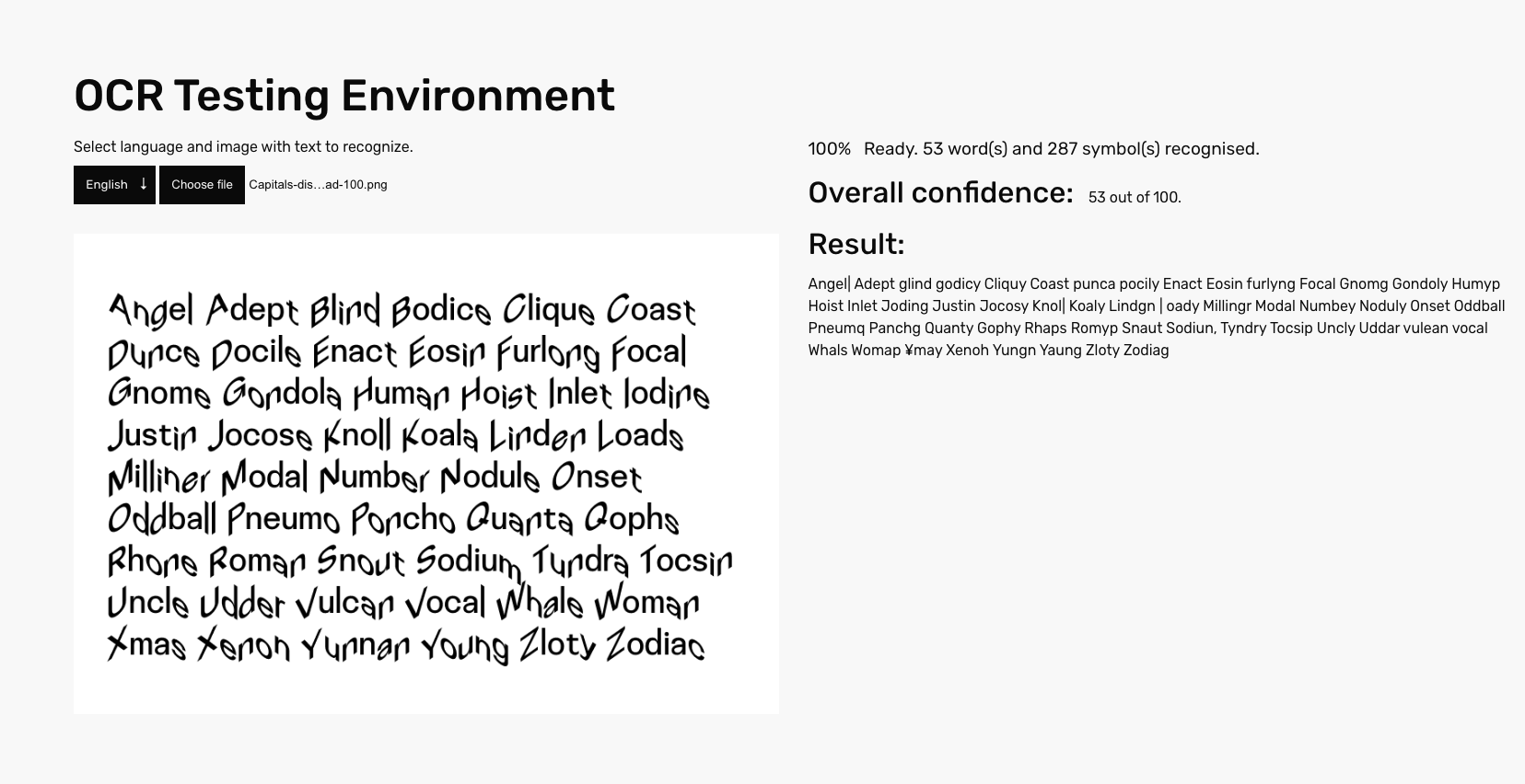
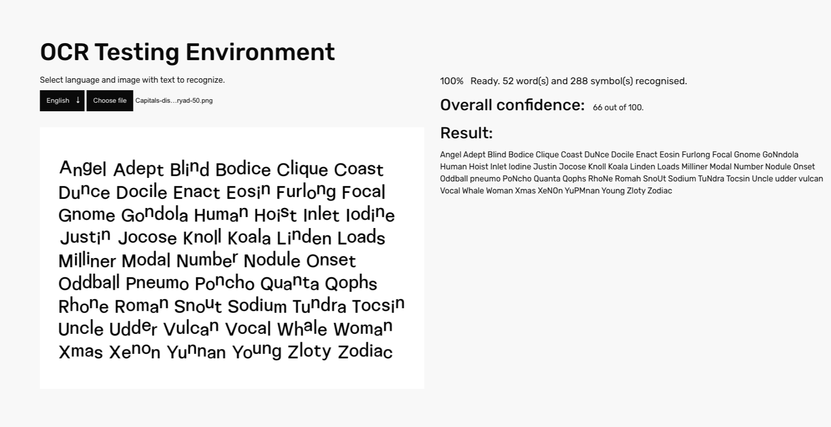
If using advance only on a single axis, we are able to lower confidence score (for horizontal advance from 90, to 53.3 out of 100; for vertical advance from 90 to 58.8 on average), but wrong text is only returned when we approach the maximal value.
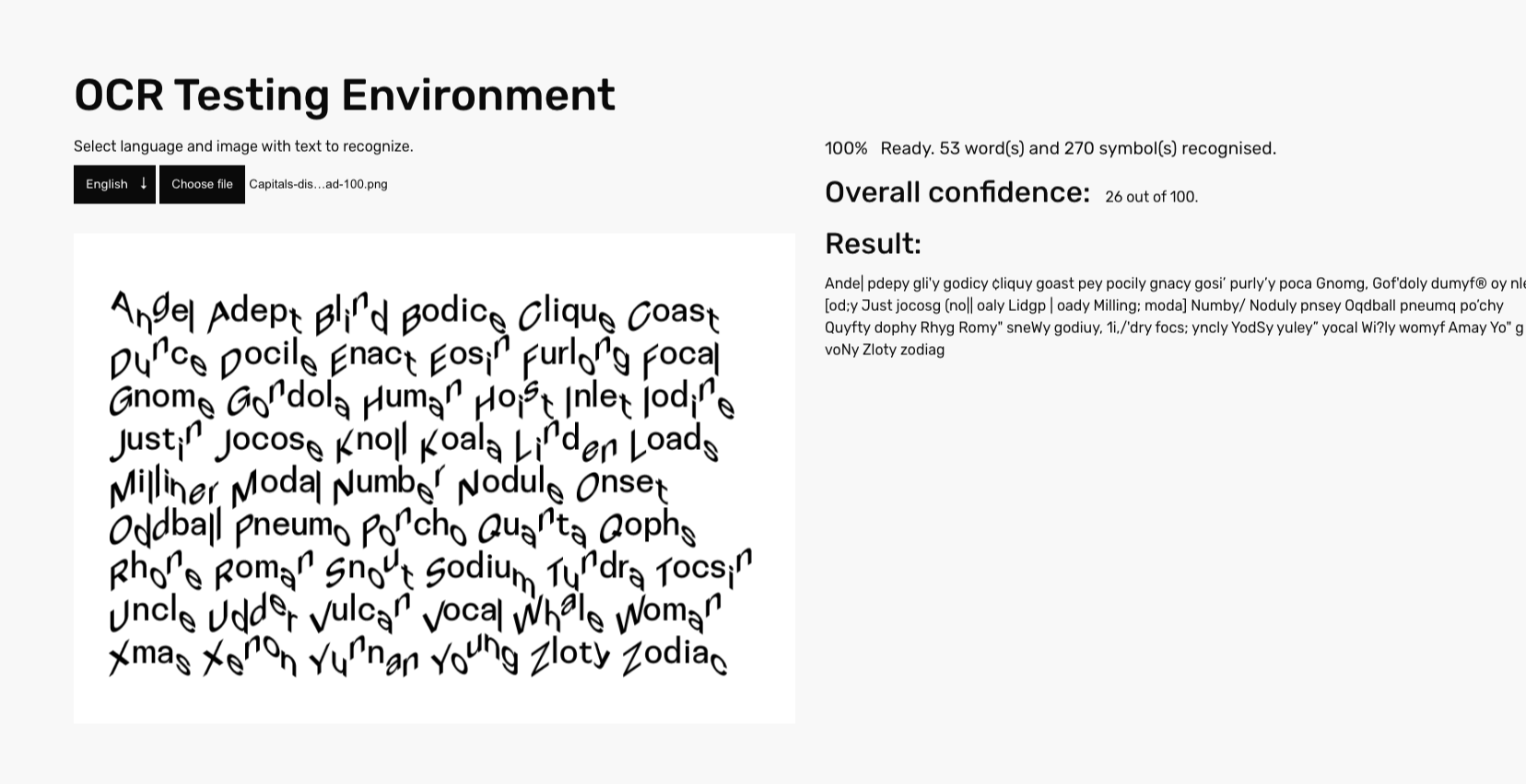
The best result, however, is achieved by combining advance on both axes — here we are not only getting wrong text, but also the confidence score is lowered from 90 to 38 at the maximal value for both axes. One of the most important takeaways here — high confidence score not always means valid output.
