Disruption Monospace Variable Font
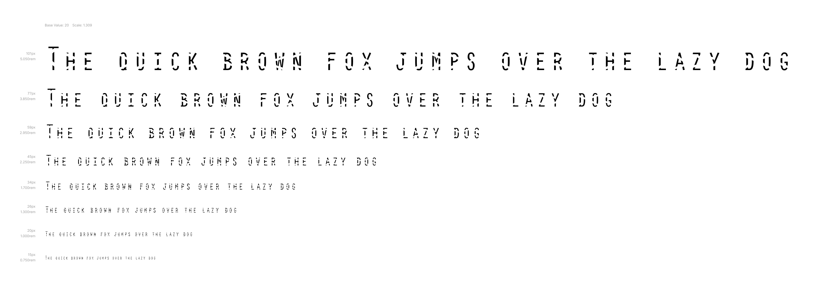
monospaced capitals and small capitals only typeface
Concept
In the early 20th century, Gestalt psychologists Max Wertheimer, Kurt Koffka, and Wolfgang Kohler developed a set of principles aimed at describing how people visually perceive and organise the world. These principles are commonly referred to as Gestalt Laws or the Gestalt Principles. Graphic designers embraced Gestalt Principles in order to create aesthetically pleasing designs with well-placed elements. There are more than 10 overlapping principles, but the most popular principles include proximity, similarity, common regions, and closure.
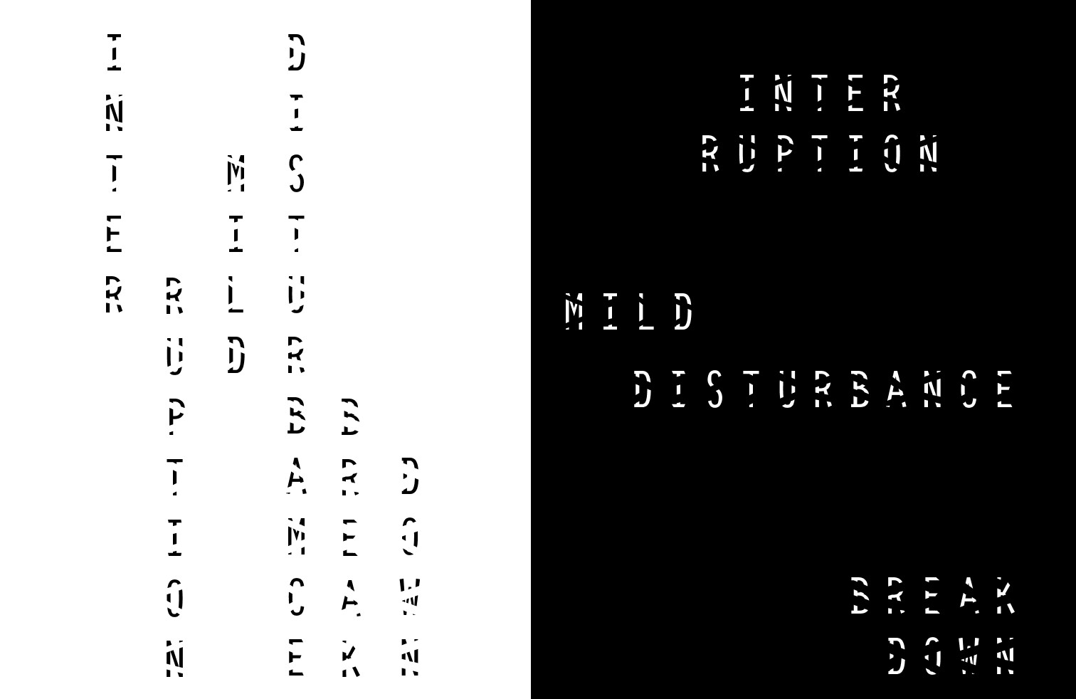
The typeface design of Disruption Monospace VF utilises the principle of closure (Reification) in visual design, which states that human minds prefer complete shapes, so we automatically fill the gaps between elements to perceive a complete image. This principle is often used in logo design, where designers use negative space to create a shape that is not actually there.
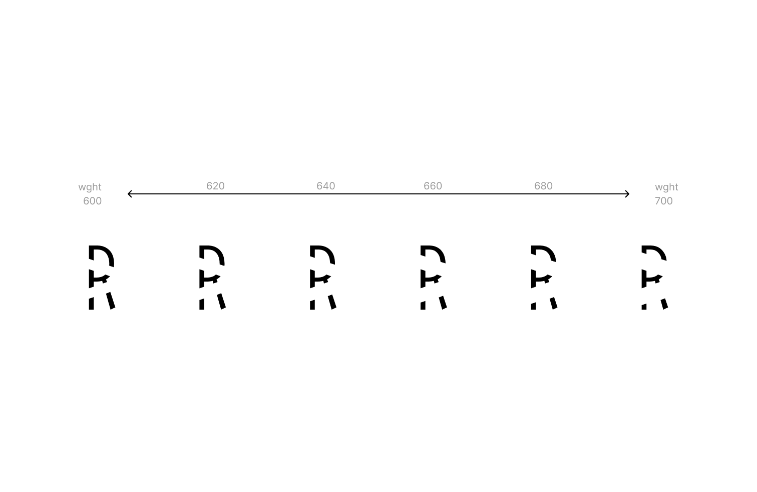
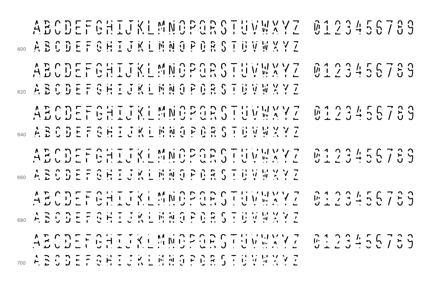
As a first step, I designed a monospaced typeface, consisting of capitals, small capitals for lowercase letters and a set of numbers, which is a base for the application of the principle of closure. The idea is rather straightforward — to remove or hide parts of the glyph in order to interrupt the familiar shape of the letter, making it harder for OCR software to make a match in full confidence. Next step — introduce a “disruptor”, which will become more present along the variation axis. The first iteration included horizontal rectangular shapes, placed along the vertical grid of 10 subdivisions from baseline to capital height of a glyph. Hoverer, this type of disruption in the letterform didn't prove effective, OCR software had little problem ignoring it and correctly recognising letter shapes. The final iteration introduced rectangular disruptors placed diagonally with starting and ending points aligned to the width of the glyph, as well as a 20-step subdivision grid on a glyph height.
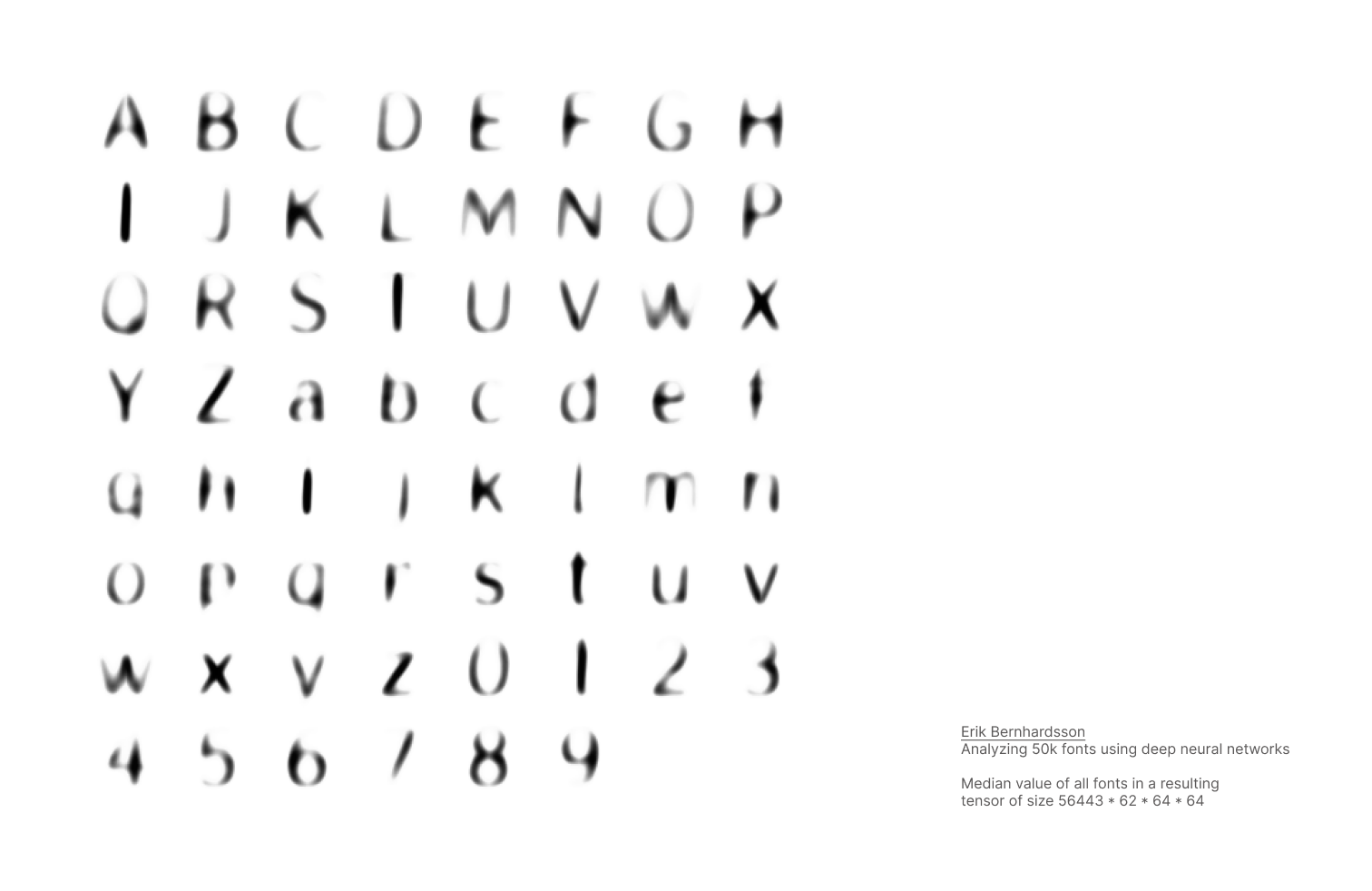
Another important thing to consider in the process of typeface design is: where to place the “disruptor”? To approach this issue methodically, I considered the work of Erik Bernhardsson, who analysed 50 000 fonts using deep neural networks. As one of the many steps, he compiled a tensor of all the processed fonts and rendered a median value of all the fonts. In a sense, this image answers the question of what part of the letter defines a particular letter across different typefaces. This way I decided to try to place the “disruptor” close to the darkest area on the median image (e.g. in the letter 'N' start and end of the diagonal stroke). The result of this experiment is a monospaced variable font, consisting of 64 glyphs, every single of them interrupted with 1-2 “disruptors”, whose size is changing along the axis of variation.
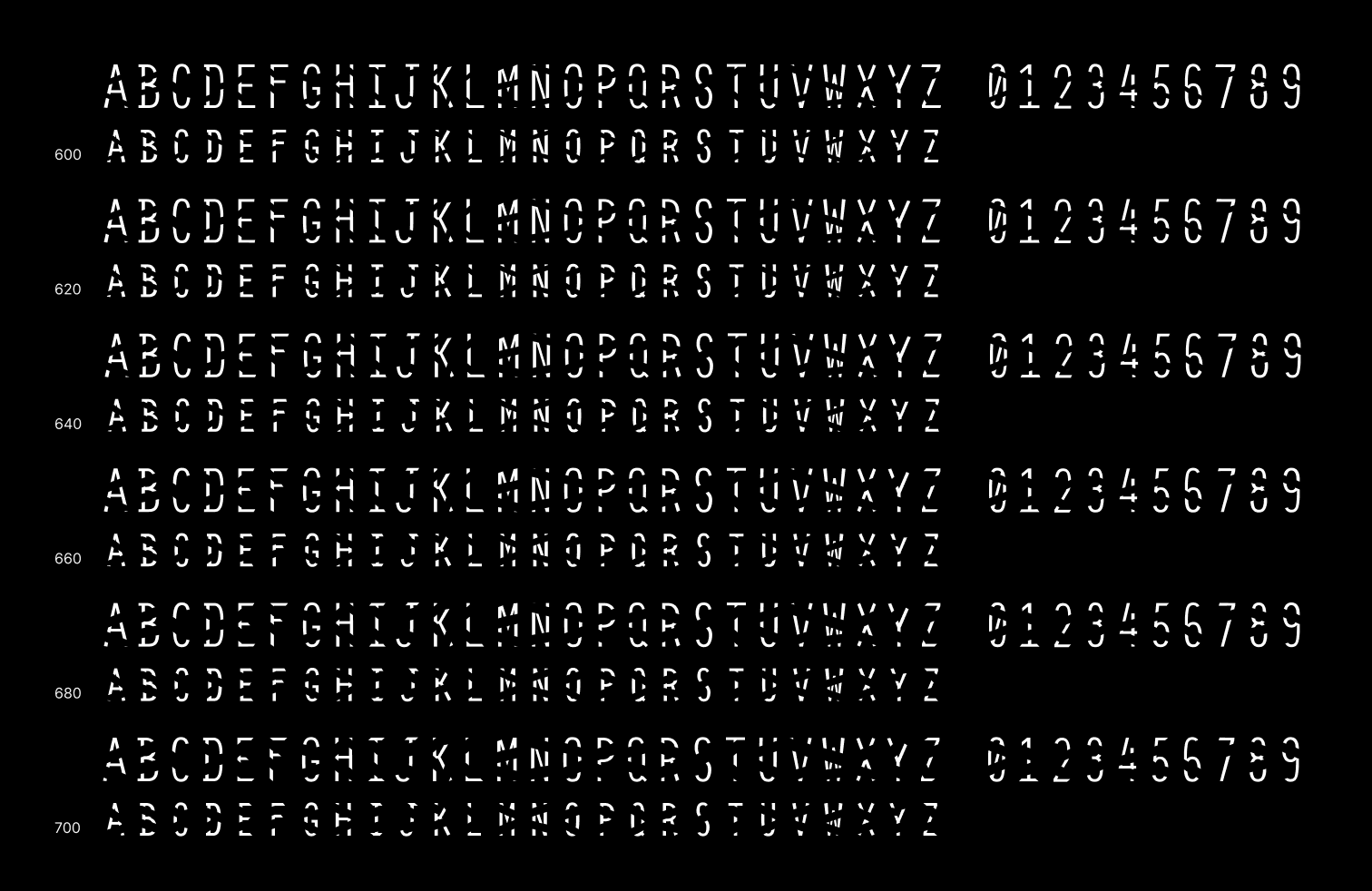
Character Set
OCR testing
Testing assets
The tests are conducted on the Hoefler's Proof uppercase 1.0, whis is an illustrative list of english words, organized logically. Using this list instead of classic pangrams allows to test the font's legibility and OCR recognition in a more realistic context.
Since this font in not really optimized for small sizes, descision was made to pull the testing text apart for shorter strings and use larger font size, even though it may have some influence on the final OCR score. If we use larger font size and fewer words in testing, it will on one hand speed up the recognition process, but provide clearer shapes ofletters for OCR to work with. After some consideration, it was also assumed, that in such case there will be also less context on the test page for OCR to support a decision to recognise shape as a letter, so in the end it seemed like a fair trade-off.
In order to maintain uniformity, 3 testing sets were created - for 600, 650 and 700 along the weight axis. For each weight two sizes were selected: 40pt and 80pt, with line height 100% of font size.
Testing method
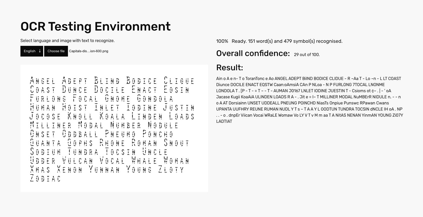
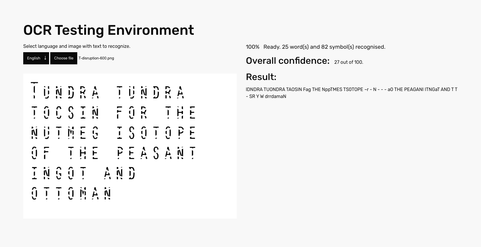
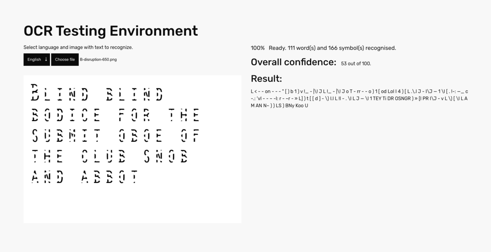
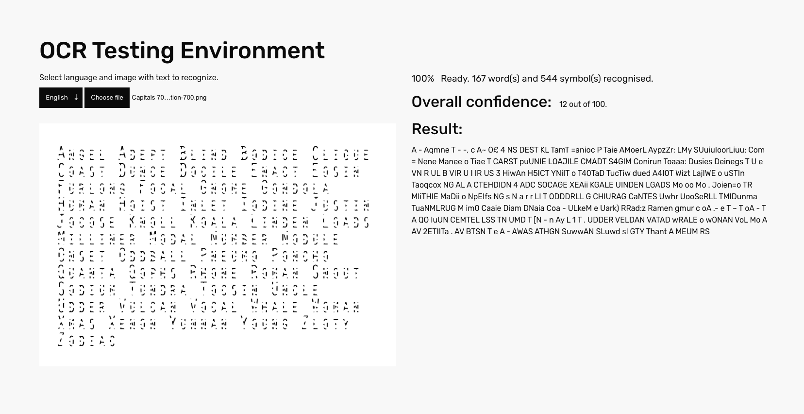
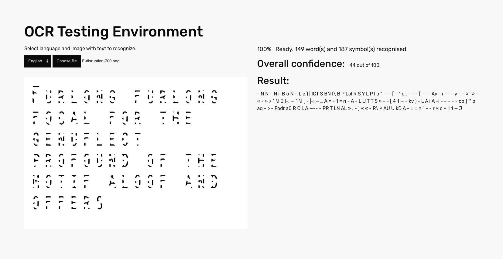
As a next step, test images containing sample text, set in selected font settings were generated. With 27 images per font setting, there are altogether 81 testing images for Disruption Monospace VF. Those were loaded individually into the OCR testing environment, recognition results documented in a screenshots and a score table and later evaluated.
Results
Oft, misinterpretation goes along the following patterns—either just one letter in a word interpreted wrong (which invalidates the usefulness of the output all the same) or replaced by either a set of “thrash glyphs” (something like “" - - 0-- - ”)or a pair of wrong glyphs. Also, the case is confused on all sets — either everything is in uppercase or mixed.
For the weight 600 average confidence score is 38.5, median lies by 38, which suggests a symmetrical distribution of scores in this case. The highest score for this testing set is 54 out of 100, the lowest one being 27 out of 100.
The weight at the point of 650 shows an average confidence score of 29,5 and a median of 26, what indicates that the dataset is slightly positively skewed. In other words, there is a concentration of confidence score values towards the lower end of the distribution and/or some high-score outliers. The highest score is 53, the lowest is 5 out of 100.
The farthest point on the variation axis (700) has an average confidence score of 33,4 out of 100 and the median is not far away at 34, which, again, shows a more or less symmetrical distribution of test scores. The lowest score is 12 and the highest is 44 out of 100 points.
Looking back at the results, I would also consider this approach borderline successful, since no text asset returned the correct string of text, even though some were really close.
