Resolution Display Variable Font
all-caps heavy display typeface
Concept
Inspired by Hito Steuerl’s aspiration to be(come) invisible through occupying the low-resolution spaces (less-than-a pixel) this strategy utilises the basic rectangular shape of a pixel (1:1 rectangle) to 'hide' the glyphs from the OCR software.
Other type designers also considered rectangular shape in their creative strategies. Barry Spencer’s Blank Typeface explored the legibility of letterforms, devoid of recognisable characteristics within the word context.
Among being “invisible” and devoid of distinct letterform characteristics, the rectangular shape also bears the reference to censorship. Christine Rudi's master's thesis explored how information is restricted, banned, made unrecognisable, and inaccessible. To visualise these practices, she designed the font Index Mono, which combines the two extremes of censorship - blackening and disappearance (font can be bolded beyond recognition or become so thin, it virtually disappears). Another font, Pixel Typewriter, refers to pixelation in digital space as well as to the typewriter as a political instrument used to produce banned literature.
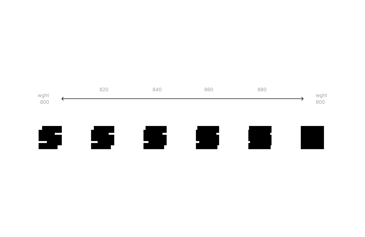
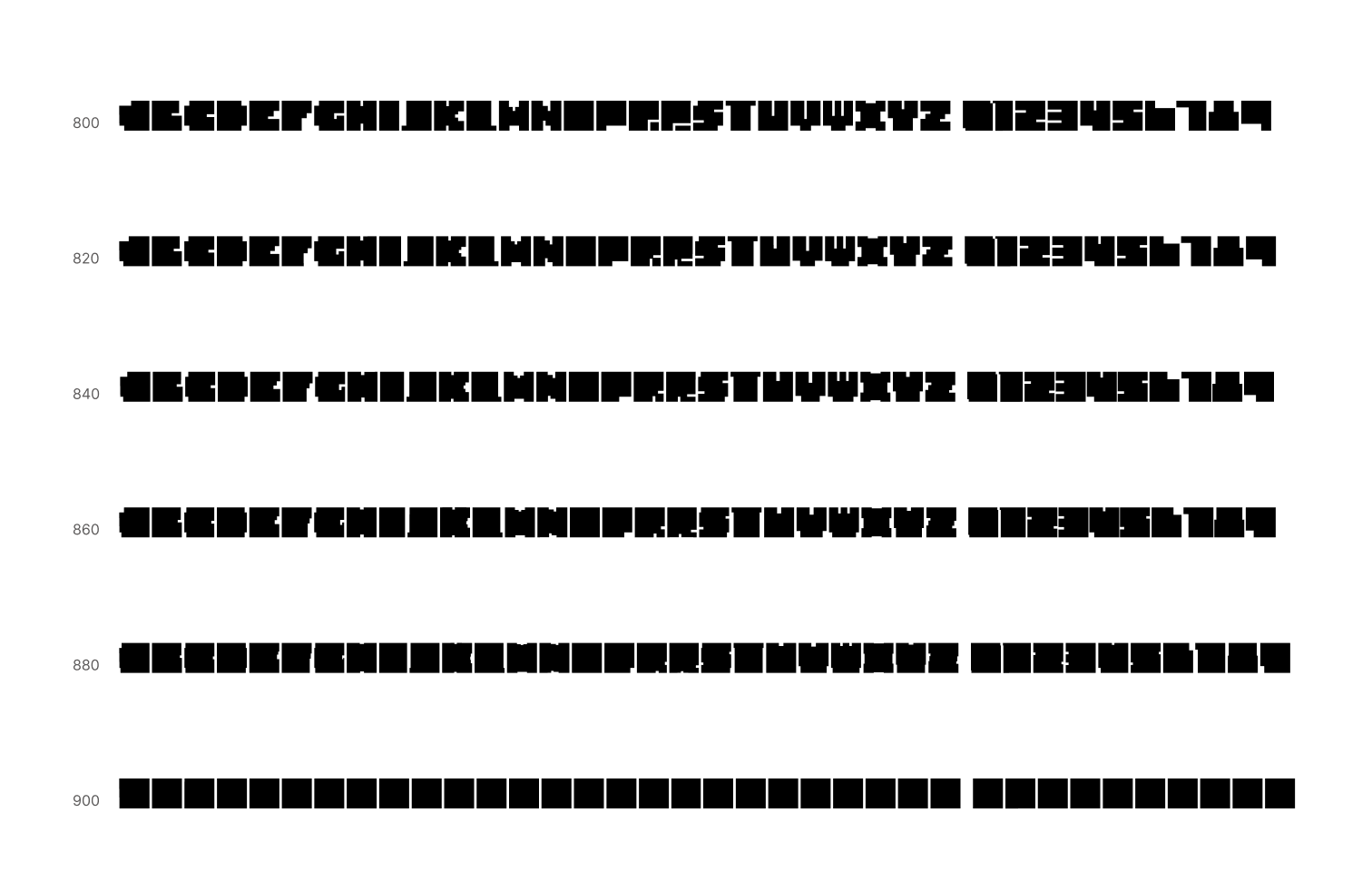
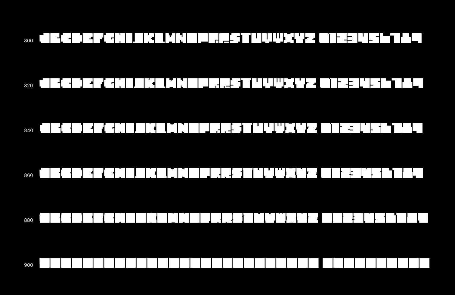
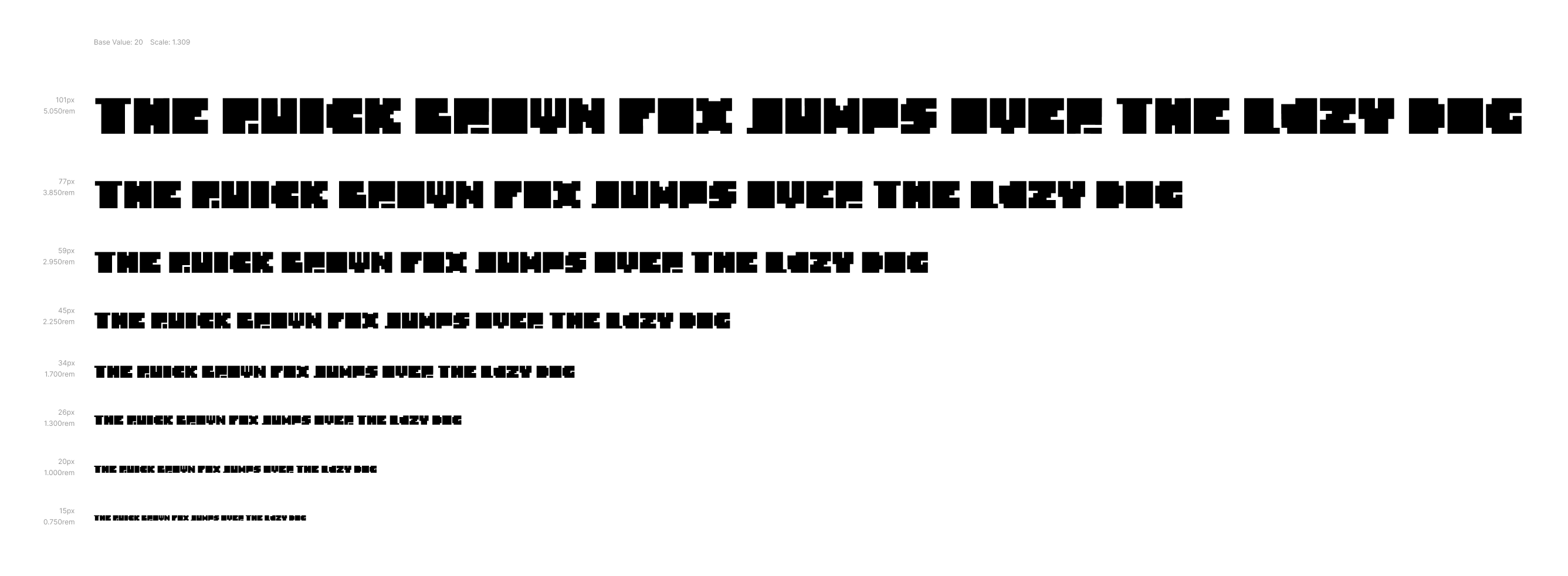
The result of experimenting with is Resolution Display VF, all-capitals display font with one axis of variation, which 'dissolves' its rather limited letterform characteristics in the rectangular shape. This font contains 38 glyphs (basic latin set + numerals) and intended to be used at large sizes, for example for headlines. The ornamental characteristics of this typeface also make it appropriate for designing backgrounds. But of course, the main goal of this experiment is to taunt the OCR system.
Character Set
OCR testing
Testing assets
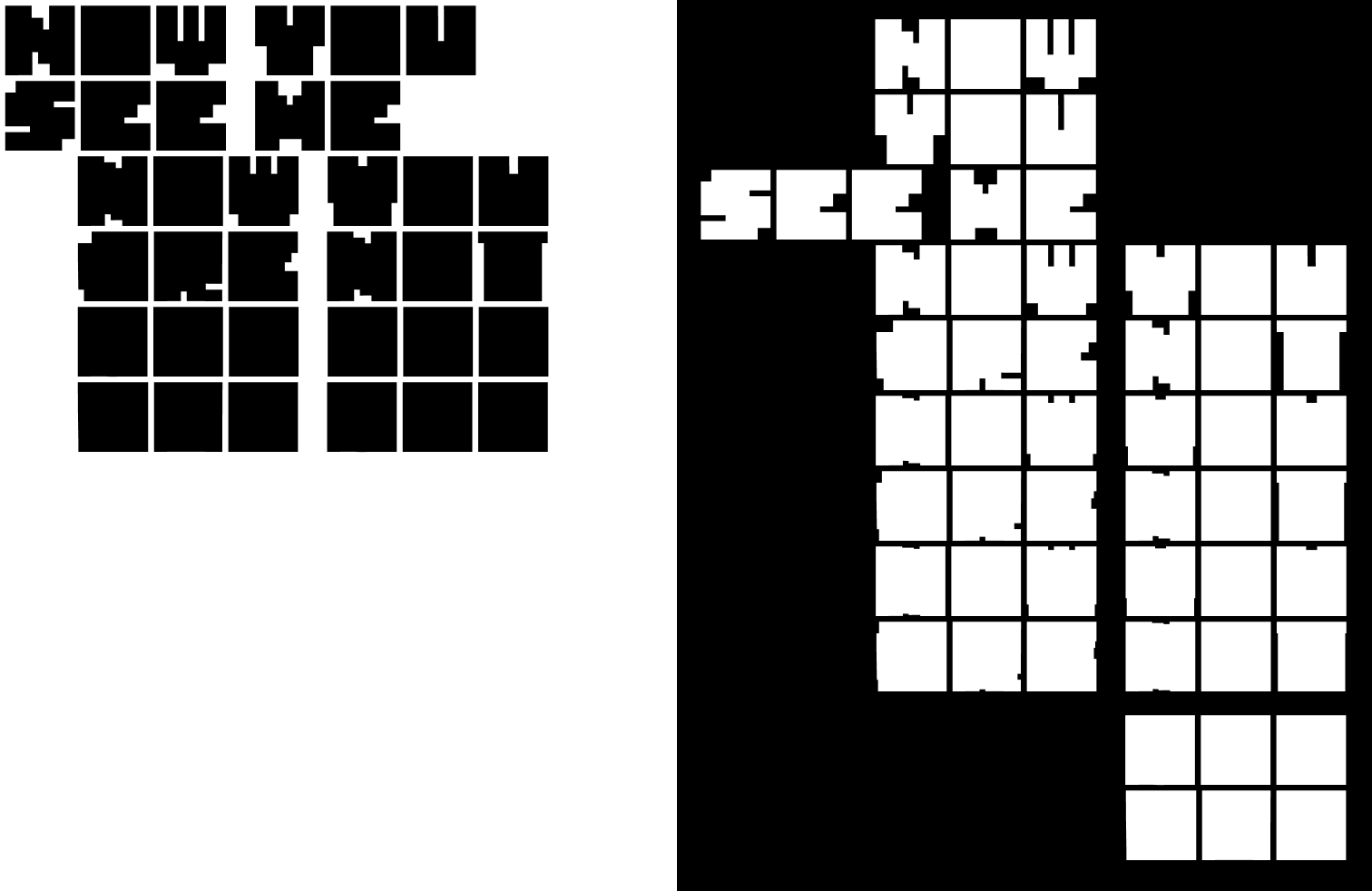
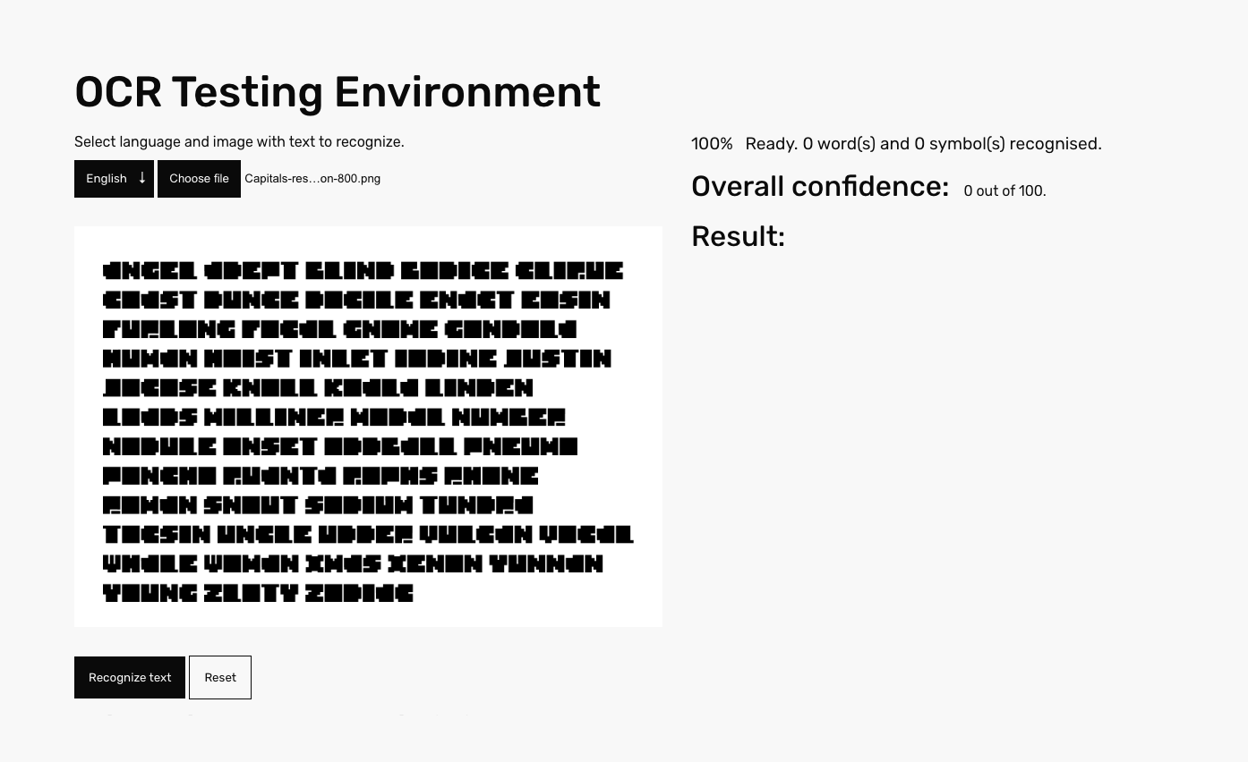
The tests are conducted on the Hoefler's Proof uppercase 1.0, whis is an illustrative list of english words, organized logically. Using this list instead of classic pangrams allows to test the font's legibility and OCR recognition in a more realistic context.
Since this font in not really optimized for small sizes, descision was made to pull the testing text apart for shorter strings and use larger font size, even though it may have some influence on the final OCR score. If we use larger font size and fewer words in testing, it will on one hand speed up the recognition process, but provide clearer shapes ofletters for OCR to work with. After some consideration, it was also assumed, that in such case there will be also less context on the test page for OCR to support a decision to recognise shape as a letter, so in the end it seemed like a fair trade-off.
In order to maintain uniformity, 3 testing sets were created - for 800, 850 and 900 along the weight axis. For each weight two sizes were selected: 42pt and 80pt, with line height 100% of font size.
Testing method
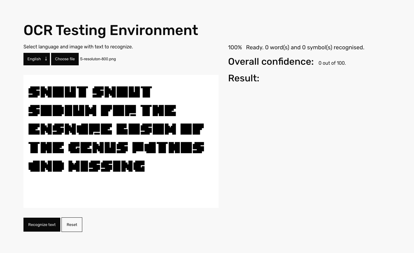
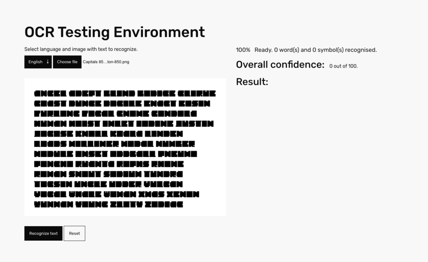
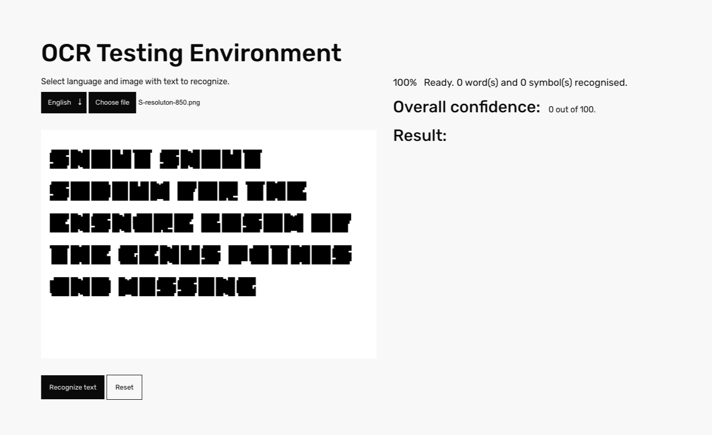
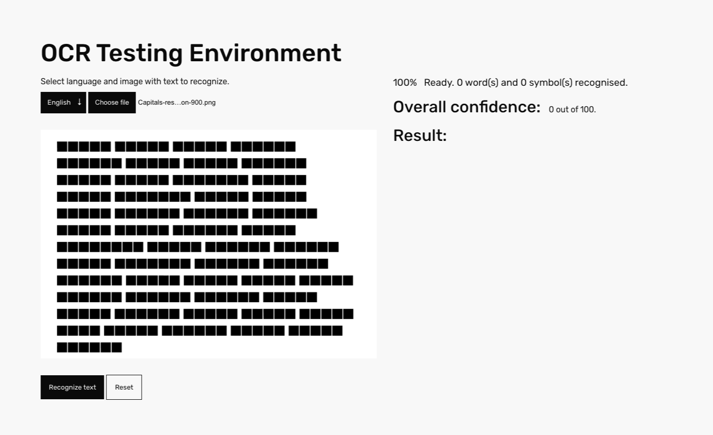
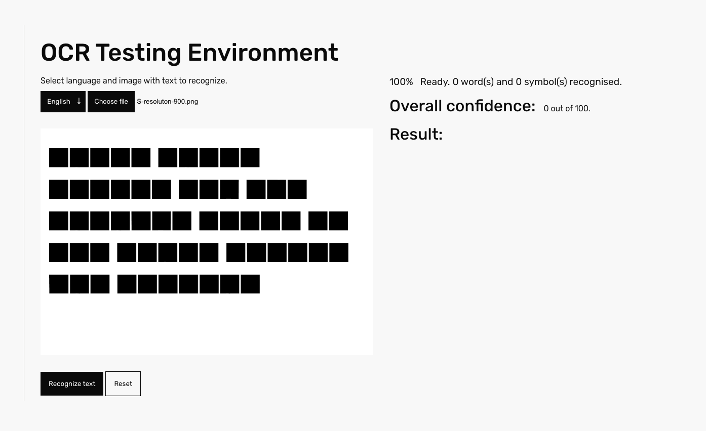
As a next step, test images containing sample text, set in selected font settings were generated. With 27 images per font setting, there are altogether 81 testing images for Resolution VF. Those were loaded individually into the OCR testing environment, recognition results documented in a screenshots and later evaluated.
Results
All of the testing assets returned with the confidence score 0 of 100, which allows us to conclude, that OCR system didn't perceive testing assets as a text at all. It came a bit as a surprise, since I expected for OCR system at least to try to cluster some geometrical forms as 'O', 'I' or 'L'. But overall, I would consider this result successful, since the text remained completely obscure.
